One Design,
Every Device
Half the world is browsing on mobile. Can your site keep up? A responsive website means better reach, rankings, and user trust. Let’s make yours ready.
Read More

Talk to a
Website Expert
Our Responsive Web Design Services
At Global Media Insight (GMI), we specialize in crafting responsive web designs that adapt effortlessly to all screen sizes, ensuring an exceptional user experience across desktops, tablets, and smartphones. Our responsive web design services are focused on performance, usability, and aesthetics to help businesses stay ahead in the digital landscape.

Custom Responsive
Website Design
We create visually compelling, mobile-optimized websites that adapt seamlessly across desktops, tablets, and smartphones. Every design is tailored to reflect your brand and provide the best user experience on every screen size.

UI/UX Design
for All Devices
Our UI/UX experts craft intuitive and accessible interfaces that ensure easy navigation and optimal engagement across all devices. We focus on enhancing user journeys and reducing bounce rates through responsive design practices.

Responsive E-commerce Website Development
Whether you’re launching a new online store or upgrading an existing one, we design fully responsive e-commerce websites that load fast and offer a consistent shopping experience across devices, boosting conversion rates.
Key Features of Our Responsive Web Design Services in Dubai
At Global Media Insight, we go beyond aesthetics. Our responsive web design services are crafted to deliver seamless experiences across devices — whether it’s a smartphone in Sharjah, a tablet in Dubai Marina, or a desktop in Downtown Dubai. Here's what makes our designs stand out:

Fluid Grid Layouts
We build websites using flexible grid systems that automatically adjust content based on screen size and orientation. This ensures every element — from text to images — fits perfectly without clutter or distortion.

Flexible Media and Images
No more zooming or pinching. All media elements on our responsive websites are dynamically resized to ensure sharp visuals and consistent presentation, regardless of device resolution.

Mobile-First Approach
With mobile traffic dominating the digital landscape, our designers prioritize mobile usability from the ground up. We ensure your site loads fast, looks great, and functions flawlessly on even the smallest screens.

Touchscreen-Friendly Navigation
We design intuitive navigation menus and interactive elements that are easy to use on touchscreens. Buttons, sliders, and links are optimized for tap-based interactions without compromising desktop functionality.

Cross-Browser & Cross-Device Compatibility
Your website will be tested across major browsers (Chrome, Safari, Firefox, Edge) and devices (Android, iOS, tablets, laptops) to guarantee a consistent and glitch-free user experience.

Lightning-Fast Loading Speeds
We optimize your site for speed using clean code, image compression, and performance best practices — ensuring a smooth experience even on slower mobile networks.

SEO-Friendly Codebase
Our websites are built with clean, semantic HTML5/CSS3 code and structured data to improve your search engine visibility. A responsive site boosts your SEO — helping you rank better on Google, especially in mobile searches.

Scalability & Future-Proofing
As your business grows, your website should evolve with it. We create responsive designs that are scalable and easy to update, ensuring long-term usability and minimal maintenance costs.

Enhanced Security Integration
We embed essential security features into every responsive website we build — including SSL certificates, secure coding practices, and regular updates. This ensures your visitors’ data — and your brand’s reputation — remain protected at all times.
Why Choose GMI for
Responsive Web Design Services?

At Global Media Insight, we believe in creating solutions that are modern, consistent, and professional. Our 26 years of experience in the web design and development field has supplied us with invaluable insights in helping businesses achieve amazing growth.
We understand the need for responsive web design in developing a consistent and effective online presence. Having worked with several leading companies and delivering solutions that helped them create or improve their website strategies, we are proud to call ourselves a top responsive web design agency in Dubai and UAE. Our experts are equipped to handle diverse client requirements and provide custom strategies unique for every business need. Want to know more about us?
THINK MODERN. THINK UPDATED. CHOOSE RESPONSIVE WEB DESIGN.
Our Responsive Web Design Process


Crafting a responsive website requires more than just visuals — it takes strategy, precision, and attention to user experience. Here’s a step-by-step look at how we build high-performing responsive websites:

Discovery & Planning
We start with an in-depth analysis of your website to identify performance issues, security vulnerabilities, broken links, and outdated plugins or software. This step ensures your website has a solid foundation for continuous, hassle-free maintenance.

Wireframing & UX Design
Wireframes and user journey maps are created to define layout, flow, and functionality. This ensures a seamless experience for users on all devices, from mobile to desktop.

Responsive UI Design
With user experience in place, visual design comes into play. Custom UI elements, consistent branding, and adaptive components are designed to adjust fluidly across mobile, tablet, and desktop views.

Development & Integration
The approved designs are transformed into responsive code using modern web technologies like HTML5, CSS3, and JavaScript. If needed, the site is also integrated with a CMS or backend system for easy management.

Testing Across Devices
We routinely monitor page speed, optimize images, clean up databases, and enhance caching to maintain fast loading timesThe website undergoes thorough testing across various browsers and devices to ensure responsive behavior, fast loading times, and flawless functionality under real-world conditions.

Launch & Optimization
Once everything is perfect, the site is launched. Post-launch support includes performance monitoring, ongoing optimizations, and applying user feedback to continuously enhance the experience.
Where Design Meets Expertise
+
Years of Experience
+
Happy Clients
+
AMC Team
+
Global Locations
+
Brand Likes
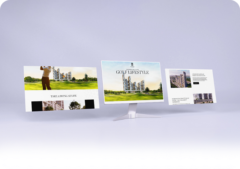
Trusted by over 1000+ companies around the world

Developed multi-brand FMCG website with rich content and recipes.

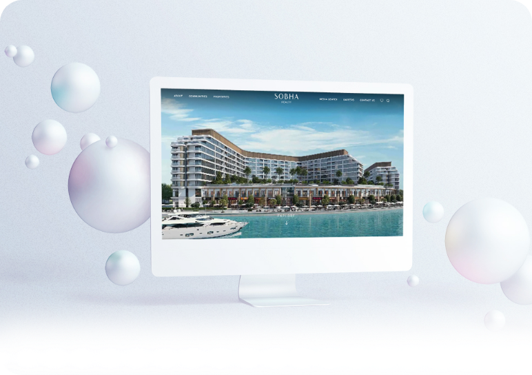
Presented brand vision through visual storytelling.

Enhanced site functionality with dynamic search and key information, ensuring smooth operation of airline’s official website.

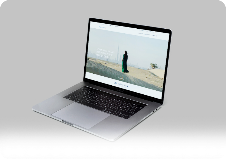
Showcased company strengths with striking visuals and clear messaging.

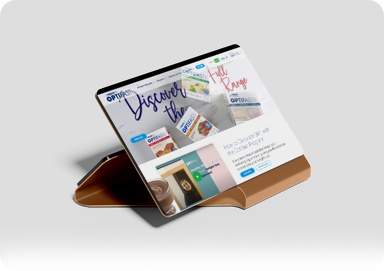
Improved user interaction with helpful tools and social features.


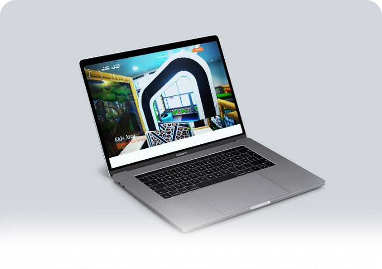
Designed engaging interface with layered visuals and responsive elements.

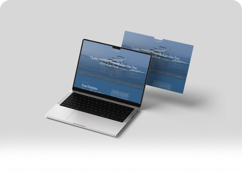
Developed thematic design with interactive visuals and easy connection forms.
Added dynamic visuals and interactive elements reflecting brand style.

Incorporated videos, interactive pop-ups, and user-friendly forms.
What Our Client Says
We were looking for a web design agency that could blend creativity with technical skill, and GMI checked all the boxes. The responsive design they built for us ensures our content looks perfect on every screen, and the site speed has improved dramatically.
— Meera Patel
The team at GMI did a fantastic job redesigning our website. It’s not only visually appealing but also fully responsive. We love how smoothly the layout adapts to mobile devices, and our customers have noticed the improvement too.
— Hassan Rafiq
GMI nailed our website design project. The new design is clean, professional, and completely responsive. We’ve seen better engagement and a lower bounce rate since launch. It’s clear that their team understands both aesthetics and functionality.
— Nikhil Mehta
Our goal was to create a responsive website that looked great and performed well on any screen size. Global Media Insight delivered exactly that. Their design team paid attention to every detail, and the site works flawlessly on mobile, which is where most of our traffic comes from.
— Layla Ahmed
Looking for responsive web design in Dubai? Let’s get started
Enquire Now


This site is registered on wpml.org as a development site. Switch to a production site key to remove this banner.