A heatmap is a great tool for visualizing complex statistical data and understanding what users do on your website, including where they click, how far they scroll, where they spend most of their time, and what they look at or ignore. The ultimate way to measure how your users interact and use your website is through heatmaps and session replays. Nowadays, most websites use heatmaps to make data sets comprehensible and actionable. Also, there are plenty of Heatmap service providers available in the market.
Let’s dive deep into Heatmap and find how you can get started with it.
What is a Heatmap & What does it Show?
A heat map (or heatmap) is a two-dimensional graphical representation of data where values are represented by colour. The colour variation may be by hue or intensity and provides an immediate visual summary of information to the reader about how your users use your site at a glance. This means you can quickly pinpoint elements of your website layout that perfectly serve their purpose and those that deserve extra attention and care.
Heat Mapping software collects data from a web page and displays that data over the web page itself. By aggregating user behaviour, heatmaps facilitate data analysis, identify trends, and optimize for further engagement. Heatmaps are most commonly used to show user behaviour on specific web pages, like where users have clicked on a page, how far they have scrolled down a page, and what they look at or ignore. These data can be handy for conversion rate optimization, thereby improving the user experience on their website.
What are the Different Types of Heatmaps?
There are several types of Heat Maps available:
- Click maps
- Scroll maps
- Attention maps
- Mouse move maps, etc.
1. Click maps
Click maps show you aggregate data of where the website visitors click with the mouse on desktop devices and tap their finger on mobile devices. The map is colour-coded to understand which elements have been clicked and tapped the most. The colour codes go like this – blue means fewer clicks; yellow indicates more clicks, and the most clicks are bright red spots. These colour codes may vary depending on the tool you have been using.
Example for click map:
2. Scroll maps
Scroll maps show you how far people scroll down on a page: the redder the area, the more visitors have seen it. This will help you to understand where users tend to drop off. Generally, the longer the page, the fewer people scroll down to the bottom. This is normal and helps you to prioritize what you want people to pay attention to and put it higher.
Example for scroll map:
3. Attention maps
Attention Heatmaps are popularly used for optimize web pages with rich content. They show which areas of the page have been viewed the most by visitors, considering how far they scroll and how long they spend on the page. By watching the color change, you will be able to modify your page’s content as per the choice of visitors. The hotter the activity, the hotter the color. The cooler the colour gets, the lesser the activity. When you analyze your website, notice if essential elements are in cooler areas, indicating they’re not getting as much attention. So you can quickly identify the user’s attention area and move your important content or buttons into that area to get more attention.
Example for Attention map:
4. Mouse move maps
Mouse move maps track where users have clicked and moved their mouse on the screen. The mouse move Heatmap allows you to view an overall layout, where visitors are moving their cursor on a page while browsing. Once data begins aggregating, you will be able to view a Heatmap of mouse movements on a page. The areas which show the most clicks and mouse activity represent the most engaging parts of your website.
The reliability of mouse move maps data is a little questionable. Just because a user’s mouse stayed on the headline for 5 minutes doesn’t mean they’re still reading the headline. Users aren’t always looking at the exact spot where their mouse is. People might be looking at stuff that they don’t hover over. They may also hover over things that get very little attention; therefore, the heat map would be inaccurate.
What is Google Analytics Heatmap (In-Page Analytics) and How to Access it?
GA has become the favourite web analytics platform for UAE, Saudi Arabia, the US and many other countries. One of the major advantages of GA is that by placing a small snippet of Google Analytics tracking code on your website, you can track most of the website metrics by default. Through its limitless features and data-driven graphs, GA has helped tons of enterprises to make ROI-based decisions. Now Google Analytics has come up with an even easier way to understand all its data with Google Analytics heat mapping. You can set this on your website by using an in-page analytics Chrome extension.
History of Google Analytics Heatmaps or In-Page Analytics
When it was first introduced in 2010, this feature was included directly in a Google Analytics report page. You were able to see your live website with click data superimposed over it right there in the context of the report. But starting with Internet Explorer 9 and relatively recent versions of Firefox and Chrome, browsers began blocking some forms of mixed content on secure HTTPS pages by default to prevent certain kinds of malware and data-stealing attacks. As a result, most people will not be able to view the In-page visual data directly in Google Analytics.
Later then, Google Analytics removed the In-page analytics feature from the GA dashboard, which now works through a Chrome extension. With the extension installed, log in to Google Analytics, and navigate to your site. Google will overlay your site’s link data. Once you install the extension, you can view click data in the form of click maps.
How to Set-up Google Analytics Heat Map?
Setting up a Google Analytics heat map is pretty easy. It is one of the simplest and most easy-to-use heat map tools in the market. In three simple steps, you can set up a Google Analytics heat map.
- Create a Google Analytics account. After account creation, you will be given a code snippet that you have to insert into the web pages that you want to track.
- Download the extension, Page Analytics. Now, for each of the web pages that you have set up, you will have a click map in the browser. You can use the click map to analyze the users’ browsing patterns.
- Turn on the icon at the top right corner of the website.
That’s it! Now you will be able to see the Google Analytics heat map with the percentage of the most clicked links. You have an option to represent the heat map in various ways, which we will discuss in the following sections.
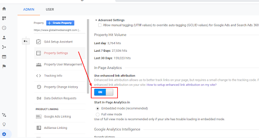
View In-page Analytics Reports with Enhanced Link Attribution
An enhanced link attribution feature was introduced in 2012 to improve In-page analytics. The key purpose of this feature is to differentiate between multiple links on a single page that lead to an identical location. If you have multiple links on the same page leading to the same destination, Google Analytics enhanced link attribution will show which link is getting more clicks.
To enable the enhanced link attribution,
→ Go to the Admin section of Google Analytics
→ Enable the “Use enhanced link attribution” icon under property settings
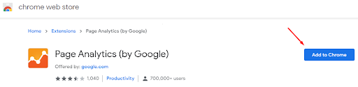
How to Install Page Analytics (Chrome Extension)?
The only way you will be able to access Google Analytics Heatmaps (In-page analytics) is via the Chrome extension. Go to the Chrome web store and install the extension on your browser.
The below link will lead you to the Chrome web store:
Once you install the extension, it first verifies if the page you are viewing is associated with the analytics account you are logged in with. If not, it will show an error message and won’t fetch the data. Also, whenever you want to see the page analytics for a specific page or site, make sure you enable the In-page analytics extension by clicking on it. Only after that the click data can be viewed in the form of click maps.
If you can’t view any data, it might be because of one of the following reasons:
- Logged into multiple Google accounts or the wrong Google account: Try logging out for all of your Google accounts and logging back into your main analytics account
- Couldn’t find any Google Analytics tags on the page
- You don’t have access to the analytics data for this page
Features of Google Heatmap Analytics
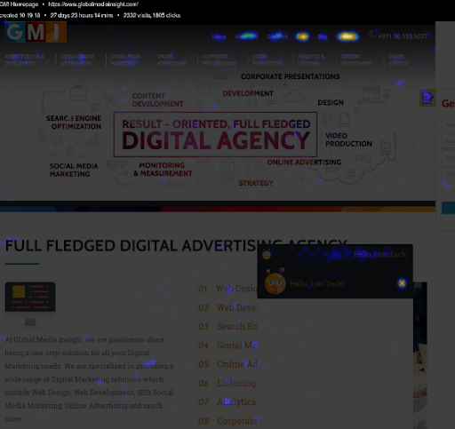
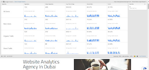
When you turn on the page analytics extension on your browser for a web page, the overview would be like this:

It gives an overview of metrics like page views, unique page views, average time on page, bounce rate and exit percentage. It also displays the number of real-time visitors. These are the default metrics that are shown when the extension is turned on. Also, it has options to change the segments and date range.
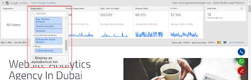
1. Segments
The best part about this particular extension is that you can change the segments. By clicking on the segment button, you can add more segments to your report, and it will appear like the below image:

You can add up to 4 segments to your report
2. Metrics
It provides an option to change the default metrics to the metrics that you want to see on the page.
3. Real-time
In-Page analytics report will show you the number of real-time visitors to your website.
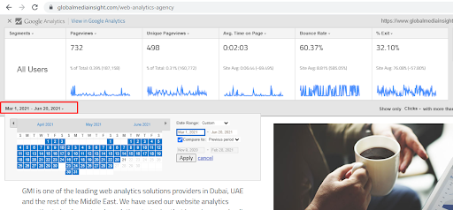
4. Select Date Range
The date range is the same as in Google Analytics. You can select from the predefined date ranges and can add comparison date ranges too.
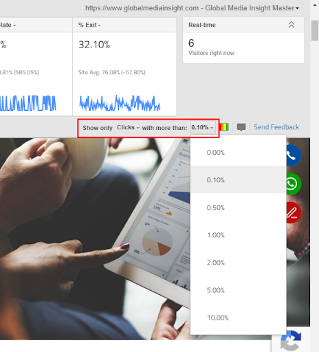
5. Click Threshold
The Click threshold on the right bottom side of the In-Page analytics window shows bubbles displaying the percentage of clicks that are recorded from the areas containing links above a specified threshold. You can customize the clicks threshold between 0% and 10%.
6. Colour Icon
Choose the “Show colours” option to see the click data in the form of colours. Here we are selected to show the click data with more than a 1.00% click rate. The colour scaling ranges from blue, green, orange to red. From this, we easily understand that the hotter areas (marked in red) are being clicked by the visitors more than the lighter areas (marked in blue).
7. Bubble Icon
You can choose to see the above data as small bubbles displaying click percentages. The map is the same as the above-mentioned colour map – the only difference is that here we can see the number of clicks and its percentage also.
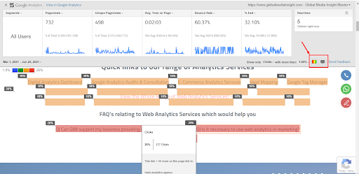
If you wish to see both the percentage of clicks and colour variation in the same map, enable both icons together.
By using them together, you can dive deep into GA data and can discover trends in user behaviour on your website pages. It also helps you to come up with data-backed solutions to fix experience-compromising elements.
Page Analytics Extension by GA has one major drawback – it only creates click maps, and that too for the links on the web pages alone. Hence, if you plan on using the website Heatmaps as a primary tool for data visualization and analysis, you will have to compare the tools available in the market and finalize the best-suited one for your needs or you can reach out to our heat map service.
How to Create a Custom Heat Map Using Google Analytics
If you want to build a heat map that is more customized for your requirements, Google Analytics gives you the option to do it. You can use Google Analytics heat map to create your own custom report. The steps you need to follow to achieve this are:
- Create a new report: Find the Custom menu on the right side of your page and click on Customization. Click on New Report and enter details such as the title of the report, metrics to measure, and dimensions (ie, days, hours, and week names).
- Set the range: Once you have created a report, you will be able to view it. On the top right, you will have an option to choose the date range. Here, set the range of time for which you want the heat map analysis.
- Export data: Now, you need to export the data to Excel. Create a pivot table with “day of the week” as columns and “hours of the day” as rows. And in the values section, place the information that you want to check.
- Apply the heat map: Choose the color in the value section and apply the heat map to see the visual representation of the data with varying color shades. To reapply the heatmap, you can change the metrics by editing the table. If you want to analyze the data in more depth, you can use total rows and columns or divide the metrics for comprehensive data.
As always, keep in mind that the larger the amount of data, the better the heat map analysis. So select a date range accordingly. For deeper analysis, you can also use the Google Analytics reporting tool.
What are the Benefits of Using a Heat map on your Website?
1. Provides an instant overview of key web performance
There are several types of Heat Maps available. Although each of them serves different purposes, the ultimate result is the overview of web performance. A Click Heatmap reveals the clicking patterns of the users, whereas the Scroll maps provide data about the scrolling patterns. Attention maps show which parts of your website are most engaging to users. Movement track mouse movements. Lastly, Geo Heat Maps reveal territories or countries where conversions are high and where they are not. In short, Heatmaps tell you at a glance what’s working and what needs to be addressed.
2. Heatmaps are more visual
Compared to other analytics tools, a Heatmap is easier to understand and analyze, even if you are not that familiar with analytics. Because it provides a visual approach to numeric values. The use of colour-coding is the best part of Heat Mapping tools. For example, a Heatmap usually overlays red and orange colours to the parts of your website that visitors interact with the most. Meanwhile, green and blue are used for elements that do not get the desired attention.
3. Makes it easier to learn from users and create user-friendly web design
Heatmaps help you understand what your audience is doing on your website, where they are clicking the most, which CTA/content is getting the most and least attention, where they spend the majority of the time, what they look at or ignore and more. These data can be used while optimizing or redesigning your website for a more user-friendly design. Combine Heatmaps and A/B testing, and your learning becomes predictive without being intrusive: You test future design choices before deploying them to a wider audience – and don’t risk alienating your users.
4. Help companies make data-driven choices that improve the bottom line
Heatmaps can help improve your overall bottom line. They can help you make better web designs that drive engagements and conversions. They can also help you reduce your landing page’s bounce rate on Google Analytics. In fact, a combination of a heatmap analysis tool and landing page software can help you increase the conversion rate of your landing pages.
Top 5 Other Heatmap Tools for your Website
There are a number of Heatmap software available in the market. Here are the top 5 among them:
1. Microsoft Clarity
Microsoft Clarity is a free analytics tool developed by Microsoft. It has three key features: Sessions Playback, Heatmaps, and Insights Dashboard which will provide you with insights into how your users are interacting with a particular site. It offers Clickmaps and Scrollmaps besides the typical filters like OS, country, timeframe, browser, etc. Microsoft Clarity manages machine learning in identifying actions like ‘excessive clicking’, ‘rage clicking’, ‘dead clicking’ in your dashboard, Heatmaps, and records of sessions.
Pricing: Free of cost
2. Hotjar
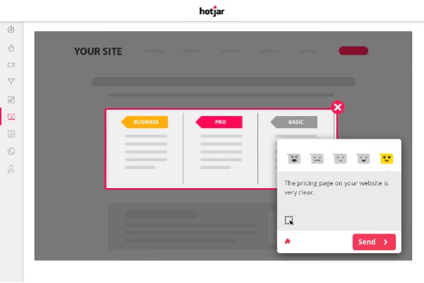
Hotjar is a powerful analytics and conversion optimization tool. They offer different types of Heatmaps like click, tap, scroll, and mouse movement Heatmaps. It combines Heatmaps, session recordings, form analytics, funnels, polls & surveys. With session recording and conversion funnels, you can discover and fix usability issues on your site. Hotar’s reporting dashboard is very easy on the eye and user-friendly.
Pricing: Start from $39 per month. They also offer a limited free plan
3. Crazy Egg
Crazy Egg is one of the most popular Heatmap tools available in the market today. It offers click, mouse cursor, scroll, and confetti Heatmaps. By using Crazy Egg, we can analyze where your visitors are coming from, what they click, and where they pause. Crazy Egg has an editor so you can make quick changes to your page. It integrates with Shopify, WordPress, and more.
Pricing: Start from $24 per month. They also offer a free trial.
4. Mouseflow
Mouseflow is another easy-to-use Heatmap tool. It offers click, scroll, movement, and attention Heatmaps. It also offers recording of website visitor activity and forms analytics, which allows you to see why users are abandoning your forms. In Mouseflow, you can add filters and segments like location, duration, traffic source, etc. to all your sessions and you can see which visitors are new or returning.
Pricing: Start from $24 per month. They also offer a limited free plan
5. Inspectlet
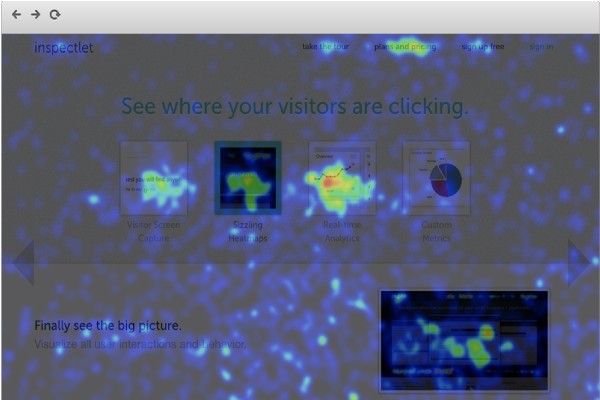
Inspectlet is a very powerful session recording and Heatmap service. It includes all three types of Heatmap tracking clicks, cursor movement, and scrolling. They also offer conversion funnel analytics with a very powerful filtering feature. Inspectlet works with AJAX, HTTPS and single-page websites.
Pricing: Start from $39 per month. They also offer a limited free plan
6. Usersnap

Usersnap is a customer feedback tool that offers complimentary functionality to heatmaps. Whereas heatmaps aggregate data based on user experience, Usersnap offers end users the ability to share their experience with screen recordings, vocal feedback, and screenshots with annotations. This allows users to directly tell you what they like and do not like, perfect for any marketing product team looking to improve websites, apps, or in-product experiences.
Pricing: Start from $19 per month to start with an additional $9 to add users or projects ad-hoc.
Conclusion
In short, Heatmaps are an effective way to visually identify business opportunities and weak points besides maximizing sales and distribution strategies. When used incorrectly, Heatmaps can be misleading. They can encourage analysts to make assumptions that may not be correct. It is important to remember that heatmaps can tell you what has happened on a page, but cannot tell you why that has happened.
If you wish to have a group of professionals to guide you through the path of handling page analytics, reach out to our Google Analytics consulting services. Our analytics experts are here to guide you in making informed decisions for your ascending growth and prospects.


